The answer to the question "What is the colour of rust?" is more a tip about modelling in general than a lesson in...

Cart 0 Product Products (empty)
No products
Free shipping! Shipping
£ 0.00 Total
Product successfully added to your shopping cart
Quantity
Total
There are 0 items in your cart. There is 1 item in your cart.
Total products (tax incl.)
Total shipping (tax excl.) Free shipping!
Total (tax incl.)
Search Tips
Tips categories
Latest Tips
-
 What is the colour of rust?Read more
 -
 Can I use fibre optics as a single lighting solution for buildings and streetlamps on my layout?Read more
Yes, fibre optics can be used as a single lighting solution for buildings and streetlamps on a model railway layout....
-
 What are the difference between Hornby and Bachmann era systems?Read more
The era system was introduced by manufacturers to help modellers identify in which period of history their model's...
-
 What is the difference between code 100 and code 75 track?Read more
There have been many fantastic advances in the world of model railways in the last twenty years. One of these is the...
-
 What is the best paint to use on a metal locomotive kit?Read more
The best paint to use on a metal locomotive kit depends on your personal preference and the desired finish. Here are...

What colour should I paint my model pond?
When painting a model pond, the colour choices are crucial for achieving a realistic effect, as water in nature reflects the environment and interacts with light. The base colours you choose should mimic the depth, clarity, and surroundings of the pond you are trying to replicate. The aim is to create the illusion of water depth, movement, and reflection, which can be tricky but rewarding when done right.
Start by considering the depth of the pond. For deeper ponds, a darker base is essential to suggest depth. Colours such as dark green, deep blue, or even black can be used to create the sense that the pond is deep and murky. A good technique is to blend these darker shades at the centre of the pond and lighten them toward the edges, where the water would naturally be shallower. For a shallow pond or stream, lighter greens, browns, and sandy yellows work well to suggest transparency and shallow water.
Next, think about the clarity of the water. If you want to represent clear water, the base colour should reflect the natural earth tones underneath the surface, like browns, ochres, and soft greens, with a slightly blue tint on top to simulate clean, fresh water. On the other hand, if the pond is more stagnant or murky, incorporating browns, muddy greens, and even dark greys can give the impression of dirt, algae, or decay. Be sure to add subtle gradients and blending between these colours to avoid a flat, unrealistic look.
The surroundings of the pond also play a key role in determining the colours. If the pond is situated in a forest or heavily vegetated area, more greens and browns should dominate the palette to reflect the foliage and the earthy surroundings. In contrast, if your pond is part of an urban or park scene, it might benefit from a cooler palette with more greys and blues to reflect sky and structures nearby.
Consider adding subtle highlights to simulate the reflective surface of the water. This can be done by dry-brushing light blues, greys, or even white along the areas that would naturally catch light, such as the edges or the tops of waves if you're including any water movement. This step helps to add realism by creating the illusion of a reflective surface and depth within the pond.
Lastly, don’t forget the finishing touches. Applying a glossy varnish after painting is essential for giving the pond that shiny, water-like finish. If you're feeling more advanced, using layers of clear resin can enhance the depth effect and allow you to add details like rocks, plants, or even fish beneath the surface.
Posted in: Scenery
Click here to receive the tips weekly in your mailbox. You can unsubscribe at any time.
Related products
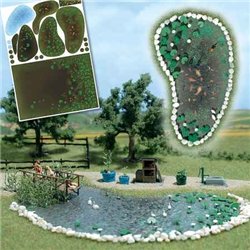
Garden Pond Set
Price: £ 18.50Add realistic garden and landscape ponds to your layout or scene. The special...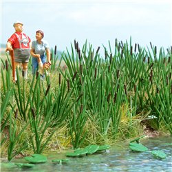
Bulrushes Kit for ponds, rivers and other...
Price: £ 10.75A plastic kit to build 120 bulrush plants commonly found by the edge of...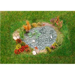
Related posts
-
 Is static grass better than scatter?I use both, separately and together. Static grass comes in various sizes from 0.5mm to 12mm while scatter is...
 - How do I apply static grass?Static grass is best applied using a static grass applicator. There are several on the market and they can apply...
- What colour are tree trunks?Tree trunks are actually grey in colour and not brown as you would think. The next time you are out and about just...
- How to make hills?You can make hills in a variety of ways. The tried and tested way is with chicken wire and papier mache. This is a...
- How do I glue scatter?Select the area where you want the scatter, then apply a layer of PVA glue, sprinkle your grass covering the glue....