Having experienced the incredible talent of many scratch-builders over the years, one would have to concede that...

Cart 0 Product Products (empty)
No products
Free shipping! Shipping
£ 0.00 Total
Product successfully added to your shopping cart
Quantity
Total
There are 0 items in your cart. There is 1 item in your cart.
Total products (tax incl.)
Total shipping (tax excl.) Free shipping!
Total (tax incl.)
Search Tips
Tips categories
Latest Tips
-
?") Is it possible to model Era 1 (Pioneering 1804-1869)?Read more
Is it possible to model Era 1 (Pioneering 1804-1869)?Read more -
 What is Maskol?Read more
Maskol is a liquid rubber solution that can be used on plastic models to cover areas that you don't want to paint....
-
 Should I use a steel-sided or wooden-sided wagon for carrying coal?Read more
Both steel-sided and wooden-sided wagons were used for carrying coal. The choice between the two depends on the...
-
 Were individual goods wagons ever fitted with brakes?Read more
Individual goods wagons were indeed fitted with brakes. Here's why brakes are essential for controlling the speed and...
-
 How can I make the terrains on my layout less uniform and more interesting and varied ?Read more
Creating realistic and diverse terrains on a model railway layout can greatly enhance its overall appearance and make...

How to recognise the British Rail late crest logo?
In 1955 British Railways was looking to the future and drew up a modernisation plan, this ultimately led to the mass introduction of diesels and electrics replacing our beloved steam motive power, but it also led to a revised logo being used on engines and rolling stock, the new logo was to be known as the lion and wheel emblem.
Until now, British Railways had been using what is commonly known as the early emblem, this was a depiction of a lion standing over the top of a huge railway wheel, the lion and its wheel were pretty much of equal size and the name British Railways was stamped through the middle of the wheel. The new logo on the other hand, was a depiction of a lion holding a much smaller wheel, also on the new logo the lion is standing in a crown that's adorned with a rose, thistle and leek to represent England, Scotland and Wales. The name British Railways was still visible on the new emblem but this time was not stamped through the middle.
There were a few variations of the new emblem, on engines a circle encompassed the lion with rectangles placed on either side to accommodate the words British and Railways, this gave the new emblem the same silhouette as London Transport's motif. On coaches, the lion was also encompassed by a circle, but this time British Railways was printed around the circumference of the logo giving the whole emblem a circular silhouette.
Both designs (although part of a modernisation plan) did little to help diesel and electric locomotives appear modern, so a cast-aluminium version of the lion and wheel was designed specifically to complement the electric blue livery that was being applied to new electric locomotives.
Eventually, it was decided that both the lion and the spoked railway wheel was a little old fashioned regardless of how it was presented, the design was replaced in 1965 with the British Rail Double Arrow logo that's still used to this day on tickets and station signs.
Posted in: Model Railway
Click here to receive the tips weekly in your mailbox. You can unsubscribe at any time.
Related products
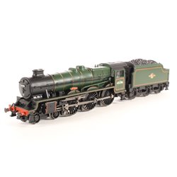
Jubilee Class 45596 'Bahamas' BR Lined Green...
Price: £ 100.00Jubilee Class 45596 'Bahamas' BR lined green with late crest and double...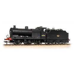
Midland Class 4F 43924 BR Black Late Crest
Price: £ 99.95Midland Class 4F 43924 BR Black Late Crest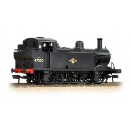
Fowler Class 3F 0?6?0 (Jinty) 47500 BR Black...
Price: £ 68.60
Related posts
-
 What scale is Hornby?Hornby model railways are OO Scale or 1/76th that is 4 millimetres to the foot (12 inches). It runs on a track with...
 - How to weight my model so it does not tip?For wargaming figures, a small coin or washer glued to the under side of the base will usually to do the job. This...
- Is Bachmann compatible with Hornby?Yes, any OO scale loco, wagon or coach will work on any OO scale track, regardless of brand. Couplings are also...
- What are the model railway eras?According to Bachmann, as it states in their catalogue there are 9 eras. As they say in their catalogue this is not...
- Can a "DCC ready" train be used on analogue?Yes, you can use a DCC ready train on your analogue layout. DCC ready just means that the train has been factory...